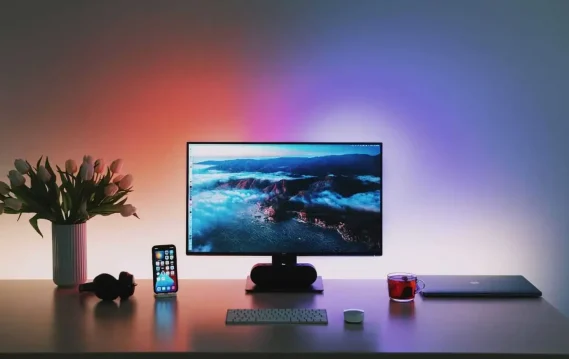
Color plays a much more significant part in our emotions than most people realize. Every color creates a different emotional response. For instance, some colors bring specific memories, while others speak to social status and even celebrations of life, death, or religion. Shades, tints, tones, brightness, and dullness in colors all influence the emotional response you will have.

Have you ever noticed when you go into a fast-food restaurant, the colors used are mainly red or orange? These colors can stimulate your appetite, increase your heart rate, and make you excited. Red, orange, and yellow can increase energy levels and represent passion, love, power, anger, or danger. In general, warm colors can make you feel happy, optimistic, refreshed, or even youthful.
On the other hand, cool colors, such as blue, green, and some purples, can create a calming, soothing atmosphere and evoke sadness. In some cases, blue can even signify loyalty, reliability, and authority. Blue tends to be the color of peace, calm, and serenity – which you can find all around us in nature that can trigger a sense of tranquility. Specific colors tend to energize you. For instance, highly pigmented, intense, neon, and brighter tones like neon green, bright red, emerald green, royal blue, turquoise, or bright yellow can make you feel more alert but may also irritate your eyes after some time.
Understanding colors and their effects on your emotions can help you define what to surround yourself with within a working environment. When working, using the science of color to determine your surroundings can affect and potentially enhance your productivity. For instance, if you are building an area or providing materials for a meeting, it’s recommended not to use red or orange so that tension doesn’t get too high. Instead, surround yourself with items or a room that has cool colors to encourage calming emotions. These should all be in mind when building out your workspace and when interacting with others. If you are working with others in a different country, it’s advised to research the meanings behind colors in their country as color meanings change.

To gain a different perspective, I reached out to one of our current Client Service Directors, Sera, an artist, to see her thoughts on colors and their role in the art world.
How does color play a role in your overall design?
Color is used in a variety of ways! You can use it to evoke certain emotions if you are working more abstractly, but you can also use it as an illusion to draw your eyes to certain areas of a piece. For example, yellow incites feelings of anxiety, while blue induces a calming feeling. In addition, the juxtaposition of contrasting colors close to one another creates a vibration in your eye that draws you to it (like blue and orange!).
Is there any color that you try to avoid, and why?
I would never say to avoid a specific color altogether. However, depending on what you are trying to accomplish, you cater to your color choices. A helpful tip is to plan to get the results you expect to get.
For more details on how to make your workspace work for you, check out our latest blog posts like this one on How to Benefit From An Ergonomic WFH Workstation.
Resources:
Header image by Linus Mimietz on Unsplash
In-text image from Canva


